I’m sick of seeing those “aesthetic” building tutorials that rely entirely on custom resource packs to look halfway decent. You watch a video, try to replicate the build in vanilla, and end up with a flat, depressing slab of cobblestone that looks like a mistake. Most of the advice out there is useless because it’s either designed for a version of the game that died three years ago or it’s just visual fluff that falls apart the second you try to scale it up. If you’re actually trying to figure out how to build a wall that is not boring without cheating with textures, you know the struggle of staring at a massive, empty stone expanse and feeling absolutely nothing.
I’m not going to give you a list of “top 10 blocks” and call it a day. I’m going to show you the exact depth-layering and gradient techniques I used when I was setting up the perimeter for my last survival server. I only write about what I have actually tested in the current version, so if I say a specific block combo works for adding texture, it’s because I’ve already spent the hours placing them myself. No hype, no fluff—just the mechanics of how to make a structure look intentional.
Table of Contents
Rejecting Generic Retaining Wall Design Ideas
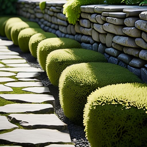
Most of the “retaining wall design ideas” you see on Pinterest are useless. They show these perfectly uniform, hyper-saturated stone layouts that look great in a single screenshot but fall apart the second you actually try to place the blocks. I’ve spent way too many hours staring at flat, grey surfaces in-game, trying to figure out why a build looks “dead” despite using high-tier materials. The problem is that most players try to follow a pattern that is too predictable. If your wall has a repeating rhythm every three blocks, it isn’t a feature; it’s a texture loop.
I don’t care for those overly polished, symmetrical builds that look like they were generated by a plugin. To actually make something work, you have to mess with the depth and layering. I stopped using standard, flat rows of stone long ago. Instead, I focus on breaking up the silhouette by mixing different stone wall patterns and varying the block orientation. If you aren’t manually checking the light levels and the way the shadows hit the edges of your blocks, you’re just building a barrier, not a structure.
Mastering Decorative Masonry Techniques I Actually Use
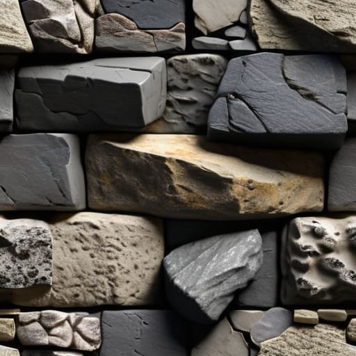
I don’t care what some “aesthetic” Pinterest board says; if you just place blocks in a straight line, your build looks like a loading error. When I’m working on a build, I rely on stone wall patterns that actually break up the eye. I usually start by mixing in deepslate variants with standard stone bricks to create a sense of depth. It isn’t about making it look “pretty”—it’s about avoiding that flat, repetitive texture that makes a base look like a glorified shipping container.
To get the depth right, I focus on layering different block heights. I’ll pull some blocks out by a single pixel or tuck others back to create natural shadows. This is one of the most effective decorative masonry techniques I’ve tested because it works regardless of your lighting setup. If you want to add more complexity, try integrating some mossy cobble or cracked bricks in random intervals. It shouldn’t look intentional; it should look like the structure has actually existed in the world for more than five minutes. Anything else is just a waste of materials.
Five Rules for Walls That Don't Look Like Flat Slabs
- Stop using a single block type for the entire surface. I’ve spent hours testing depth, and if you aren’t mixing in stairs, slabs, and walls to create actual shadows, your build is just a colored rectangle.
- Break the silhouette. A perfectly straight line is a dead giveaway of a lazy build. I always add slight irregularities or protruding sections to force the eye to move across the structure rather than just sliding past it.
- Depth is non-negotiable. If your wall is flush with the ground or the building it’s attached to, it’s boring. I always pull my support pillars forward by at least one block to create a layered effect that actually catches the light.
- Ditch the symmetry. Real structures aren’t perfect mirrors. I build my walls with intentional asymmetry—maybe a small alcove here or a slightly different texture pattern there—to make it look like the build has a history rather than being a copy-paste job.
- Use “imperfect” texturing. Don’t just cycle through three blocks randomly. I look for patterns in the block palette that mimic natural wear or structural reinforcement, ensuring the variation looks purposeful rather than like I just clicked the wrong key.
The Bottom Line on Non-Boring Walls
Stop using single-block palettes; if your wall doesn’t have at least three different textures with varying grayscale values, it’s going to look like a flat plane.
Depth is non-negotiable—I always pull my support pillars one block forward from the main wall face to break up the shadow lines.
Forget “aesthetic” Pinterest builds that rely on shaders; if the wall doesn’t look structurally sound in vanilla, it’s a bad design.
Stop Copying, Start Building
At the end of the day, a wall is only boring because you’re playing it safe with a single block type or a repetitive pattern that looks like a texture pack glitch. I’ve spent way too many hours on my own builds realizing that depth and texture variance are the only things that actually stop a build from looking like a flat plane of gray. You need to mix your materials, break up those straight lines with some intentional irregularities, and most importantly, you have to test your palette in-game before you commit to a massive build. If it looks like a repetitive mess when you’re standing five blocks away, it’s going to look even worse when you’re actually living in the base.
Don’t let the sheer amount of “aesthetic” tutorials on YouTube trick you into thinking there is a single right way to do this. Most of those creators are just following a formula that works for a screenshot but falls apart when you actually try to expand your base. My advice is simple: stop looking for a blueprint and start looking at how light hits the different surfaces you’ve placed. Once you understand how material layering changes the way a wall catches shadows, you won’t need a guide anymore. Just get in there, break the symmetry, and build something that actually looks lived-in.
Frequently Asked Questions
How do I stop the wall from looking like a massive, flat sheet of stone when I'm using deepslate?
The problem is you’re treating deepslate like a solid block of color rather than a texture. If you just spam deepslate tiles, it looks like a flat gray void. I always mix in deepslate cracks and cobble to break up the silhouette. Also, stop building flat. I use stairs and slabs to create depth—literally pulling blocks back one space to create shadows. If there’s no shadow, it’s just a wall.
What’s the best way to mix different block types without it looking like a random mess?
Stop grabbing random blocks because they “look cool.” That’s how you end up with a textured mess that looks like a glitch. I use a strict palette of three: a primary block, a secondary for depth, and a third for accenting edges. I always check the light levels first. If your transition from cobblestone to stone bricks looks jarring, you’re missing a gradient. Use stairs or slabs to break the hard lines between different types.
I don't use texture packs, so how do I actually get depth using only vanilla block shapes?
If you aren’t using texture packs, you have to stop thinking about colors and start thinking about geometry. Depth comes from light and shadow, not pixels. I always use stairs, slabs, and walls to create “offsets.” Instead of a flat surface, I pull the support pillars one block out and set the infill back. It creates actual shadows that move when the sun passes. If it looks flat, you haven’t broken the plane enough.
