Most “interior design” tutorials on YouTube are a complete waste of time. They tell you to use some fancy resource pack to make blocks look “realistic” or suggest complex build hacks that only work in outdated versions of the game. I’m sick of seeing people struggle with how to build an interior worth entering, only to realize their build looks like a generic box because they followed a guide written for a version of Minecraft that hasn’t existed for three years. If you aren’t working with the vanilla assets exactly as they are in the current build, you’re just building a house of cards that’s going to fall apart the moment you update your client.
I’m not here to give you aesthetic fluff or theoretical nonsense. I’ve spent the last week rebuilding my entire base from scratch on the latest version to see what actually works when you’re stripped of all the shortcuts. I’m going to show you the specific block palettes and depth techniques that I have personally verified through trial and error. This is a direct, no-nonsense breakdown of how to build an interior worth entering using nothing but the standard game mechanics you have right in front of you.
Table of Contents
- Mastering Spatial Arrangement Techniques I Tested in My Own Walls
- Finding Color Palette Harmony by Stripping Everything Back
- Five things I stopped doing to make my builds actually look lived-in
- What I’m actually walking away with
- Final Thoughts Before You Start Breaking Blocks
- Frequently Asked Questions
Mastering Spatial Arrangement Techniques I Tested in My Own Walls
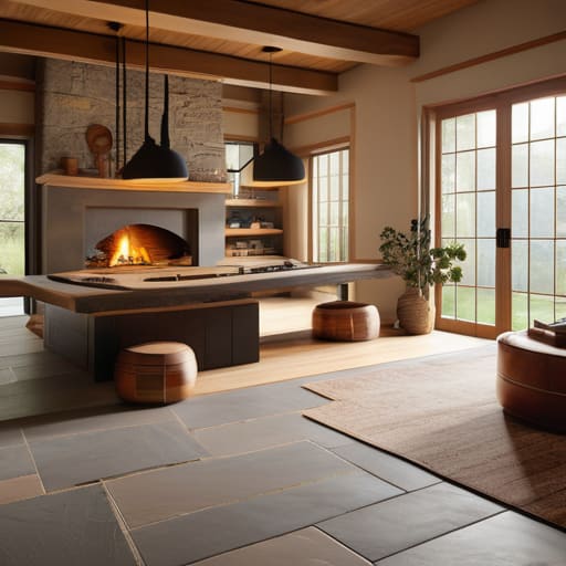
Most people just throw chests and furnaces into a room and call it a base. That’s not design; that’s just storage. While testing different layouts in my latest survival world, I realized that spatial arrangement techniques are actually about managing the player’s line of sight. If I place a crafting table in the middle of a hallway, it breaks the flow and feels cluttered. I’ve found that grouping functional blocks into “zones”—using slabs or different floor levels—is the only way to actually achieve creating cohesive living spaces without it looking like a mess of random blocks.
I also stopped trying to fill every single empty corner. I used to think a room needed a decorative pot or a lantern every three blocks to look “finished,” but it just made the space feel claustrophobic. Instead, I started applying basic minimalist decor principles to my builds. By leaving intentional negative space around my main workstations, the room actually feels breathable. It’s about knowing when to stop building and let the architecture do the heavy lifting.
Finding Color Palette Harmony by Stripping Everything Back
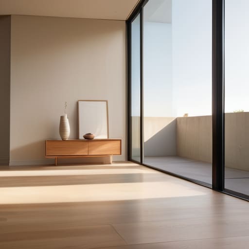
Most people try to fix a room by adding more stuff. They think a splash of red or a heavy velvet curtain will solve the problem, but they’re usually just adding noise. When I was redesigning my workspace last month, I realized the issue wasn’t the lack of detail; it was the lack of foundation. To achieve actual color palette harmony, I had to strip the room down to the bare essentials. I removed every single piece of decor until I was left with nothing but the floor, the walls, and the natural light.
Once the visual clutter was gone, I could actually see how the base tones interacted. I stopped chasing trends and focused on how a single neutral shade could anchor the entire space. This is where most people fail—they try to layer colors before they’ve established a baseline. By applying basic minimalist decor principles, I found that a limited, intentional palette does more for a room’s flow than any expensive accent piece ever could. You don’t need a hundred colors; you need three that actually work together.
Five things I stopped doing to make my builds actually look lived-in
- Stop using lighting to just “brighten the room.” I spent way too much time placing torches in every corner until I realized that real depth comes from shadows. Use light sources to highlight specific blocks—like a single lantern over a desk—rather than turning your interior into a flat, overexposed mess.
- Kill the symmetry. Everything looks fake when it’s perfectly mirrored. If you have a bookshelf on the left, don’t just slap the exact same one on the right. Put a plant or a crafting table there instead. It breaks the “grid” feeling that ruins most player-made houses.
- Layer your textures, but keep it simple. I used to think adding five different block types to a wall made it “detailed,” but it just looked noisy. Now, I use one primary block and maybe one secondary one for subtle variation. If you can’t tell what the wall is supposed to be from five blocks away, you’ve gone too far.
- Scale your furniture to the room, not the block. Most people just place a stair as a chair and call it a day. I’ve learned that if a room is large, you need “heavy” furniture—like using slabs and stairs to create actual depth—otherwise, your builds just look like empty boxes with tiny toys inside.
- Use “clutter” as a functional tool. I don’t mean throwing random items on the floor. I mean placing items that actually make sense for the space. A furnace near a smoker, or a lectern near a window. If the items don’t serve a visual purpose for the room’s theme, they’re just noise.
What I’m actually walking away with
Stop trying to fill every empty block; I learned that negative space is what actually makes a room feel intentional rather than cluttered.
Stick to a limited palette of three core materials, because as soon as I added a fourth, the whole build looked like a mess of mismatched textures.
Layouts only work if they respect the player’s movement path, so I stopped placing furniture where it clips the walking route.
Final Thoughts Before You Start Breaking Blocks
At the end of the day, building an interior that actually feels lived-in isn’t about following a template or some Pinterest-inspired layout that looks good in a screenshot but feels hollow in-game. It comes down to the two things I’ve spent the last few weeks obsessing over: intentional spatial flow and a color palette that doesn’t fight against the natural lighting of the room. I’ve seen too many builds fail because they tried to cram every single decorative block into a single corner, creating a cluttered mess that breaks the immersion. If you stick to the principles of stripping back the noise and ensuring every piece of furniture has a logical reason for existing in that specific coordinate, you’ll stop building rooms and start building spaces.
Don’t get discouraged if your first few attempts look like a disorganized storage room. I’ve spent hours tearing down half-finished builds because the scale was just slightly off or the palette felt muddy. The reality is that great design is iterative, and sometimes you have to destroy what you built to make room for what actually works. Stop looking at the tutorials that promise instant perfection and just start placing blocks. Once you stop trying to mimic someone else’s style and start testing the limits of your own walls, that’s when you’ll finally create something worth entering.
Frequently Asked Questions
How do you prevent a room from feeling cluttered when you're actually trying to add detail?
The mistake most people make is thinking “detail” means “more blocks.” If you just cram chests and lanterns into every corner, the room feels like a storage unit. I use a rule of thumb: group your high-density details into specific clusters. Instead of scattering items, I build a single, complex workstation or a dedicated corner for a fireplace. This creates “visual breathing room” in the gaps, letting the eye rest between the points of interest.
What’s the best way to handle lighting if you want to avoid that flat, artificial look?
Stop burying torches in the middle of the floor. I spent way too long staring at flat, bright rooms before I realized that direct light is the enemy of depth. I started hiding light sources under carpets, behind stairs, or inside leaf blocks to create “glow” rather than a single point of light. If you want it to look natural, you need shadows. If every corner is equally bright, you haven’t built a room; you’ve built a hospital wing.
Does using different block types for flooring actually make a difference in smaller spaces, or is it overkill?
It’s not overkill, but you have to be careful. In a small room, switching from oak planks to stone bricks for a “rug” or a walkway actually defines the zone without needing physical walls. I’ve tested this in several compact builds; if you use too many contrasting textures, the room feels cluttered and claustrophobic. Stick to two block types max. Use one for the main floor and one to accent a specific area.
