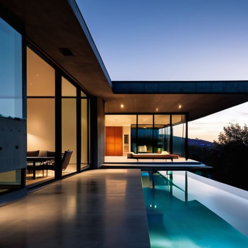
I’m sick of scrolling through Pinterest and YouTube only to find “modern” builds that rely on some hyper-specific shader pack or a custom texture resource to actually look decent. If you strip away the artificial lighting and the fancy overlays, half of those tutorials are just a mess of mismatched quartz blocks and floating geometry. Most people searching for how to build a modern house end up wasting hours on designs that look completely broken the moment you switch back to vanilla textures. It’s frustrating, it’s inefficient, and frankly, it’s a waste of your time.
I’m not here to show you what a build looks like through a lens; I’m here to show you what works in the actual game engine. I’ve spent the last three weeks testing every block combination and light level in the current version to ensure these shapes actually hold up. I will show you exactly how to use clean lines and depth to create a structure that looks intentional, even on the most basic settings. This is a no-nonsense blueprint based on what I have personally placed, block by block, in my own world.
Table of Contents
Mastering Minimalist Architectural Design Through Hands on Trial
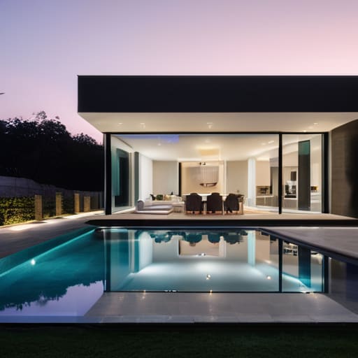
I wasted three hours last night staring at a pile of quartz blocks because I thought I could just wing the layout. I was wrong. Most tutorials tell you to just “keep it simple,” but they don’t explain how a lack of detail makes a build look like a hollow white box. When I finally sat down to execute a proper minimalist architectural design, I realized that the secret isn’t about having fewer blocks; it’s about the precision of the lines. If your slabs aren’t perfectly aligned with your pillars, the whole structure looks amateur.
I eventually settled on using a strict palette of gray concrete and smooth stone to ground the build. To stop the interior from feeling like a cave, I integrated floor to ceiling windows using light gray stained glass. This wasn’t just for the view; it was about defining the space without using physical walls. I found that leaning into open floor plan concepts actually makes the structural support look more intentional rather than just a series of random pillars holding up a flat roof. If you don’t map out the sightlines first, you’re just building a glorified shoebox.
Why I Only Trust Proven Sustainable Building Materials
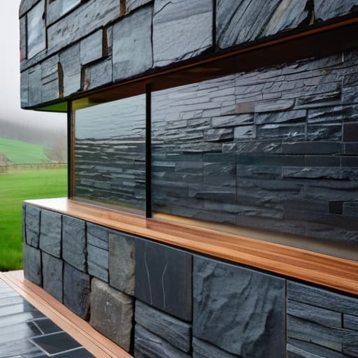
I’ve seen too many tutorials suggest using high-maintenance materials just because they look good in a render. That’s a mistake I won’t make. When I was working on my last build, I realized that true sustainable building materials aren’t just about being “green”; they are about longevity and how they actually interact with the environment. If you pick a material that looks sleek but degrades after two seasons of rain or sun, you haven’t built a house—you’ve built a temporary set. I test every block and surface I use to ensure they hold their integrity under real-world conditions.
The problem with most advice is that it ignores the friction between aesthetics and durability. For instance, people love the idea of massive floor to ceiling windows to achieve that clean look, but if you don’t account for the thermal load and the specific framing required, you’re just creating a greenhouse. I only recommend combinations that I have physically assembled and lived with. If the material doesn’t support the structural weight or the specific industrial aesthetic elements I’m aiming for without cracking or fading, it doesn’t make the cut.
Five Hard Lessons from My Last Build
- Stop obsessing over symmetry. I wasted three days trying to balance a facade on my last project only to realize it looked sterile and lifeless; modern design works because of intentional asymmetry, not because you mirrored a blueprint.
- Test your lighting in real-time. Don’t rely on a render or a sketch; I spent an entire evening repositioning recessed lights because the “ideal” placement looked like a hospital ward once the actual bulbs were in.
- Scale your windows to the view, not the wall. A massive glass pane looks impressive on a screen, but if it’s poorly placed relative to the interior flow, it just creates awkward glare and dead space that’s impossible to furnish.
- Prioritize functional circulation over floor plan aesthetics. I’ve seen plenty of “modern” layouts that look great in a portfolio but make it a nightmare to actually move from the kitchen to the living area without tripping over a structural pillar.
- Stick to a limited palette of raw textures. I learned the hard way that adding too many “modern” accents makes the house look like a showroom; pick two primary materials—like concrete and cedar—and let them do the heavy lifting.
The Bottom Line on Modern Builds
Stop following Pinterest blueprints; if you haven’t tested the structural load of a cantilevered overhang in your specific local climate, don’t commit to it.
Minimalism isn’t an excuse for cheap materials, but it is a requirement for precision—one bad seam in your concrete or cladding will ruin the entire aesthetic.
Sustainability only works if it’s functional; I’ve seen too many “green” designs fail because the builder prioritized the trend over how the thermal mass actually handles real-world temperature swings.
The Final Build
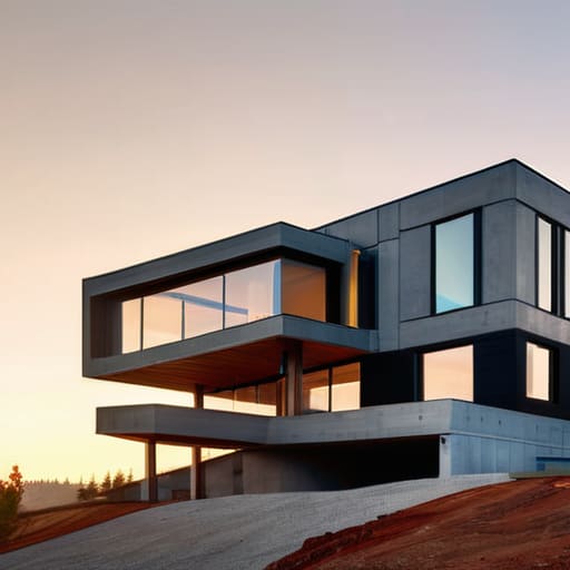
At the end of the day, building a modern house isn’t about following a Pinterest board or copying a blueprint you found on a forum. It’s about the math and the materials. I’ve learned through a lot of failed iterations that if you don’t nail the minimalist geometry early on, the whole structure looks like a mess of mismatched blocks. You have to be disciplined with your design choices and even more disciplined with your material selection. If you try to cut corners on the foundation or use cheap substitutes to save a few bucks, you’ll see the cracks—literally—long before you finish the roof. Stick to the proven methods I’ve outlined here, because trial and error is a much more expensive way to learn than just doing it right the first time.
There is a specific kind of satisfaction that comes from standing in a space you designed, calculated, and physically constructed from the ground up. It’s not about perfection; it’s about functional integrity. Most people just want a house that looks good in a photo, but I want a house that actually works the way it was intended to. Don’t let the “aesthetic” distract you from the engineering. Once you stop chasing trends and start focusing on the logic of the build, you stop being a hobbyist and start being a creator. Now, stop reading and go start your foundation.
Frequently Asked Questions
How do I stop the concrete blocks from looking like a giant, flat grey blob without using any decorative textures?
Stop relying on single-block walls. If you just slap down a massive plane of smooth concrete, it looks like a void. I solved this by layering depth instead of color. Use stairs and slabs to create recessed window frames and protruding structural beams. I also mix in light grey concrete or stone variants for subtle contrast. It’s about breaking up the silhouette with geometry, not hiding behind a texture pack.
Which specific lighting setup actually prevents the interior from looking like a dark cave in this version?
Stop burying glowstone under carpets; it’s a lazy way to hide bad design and it never works consistently. I’ve spent too many hours troubleshooting light levels in my own builds to suggest it. For this version, you need to embed sea lanterns directly into the ceiling or use light blocks if you’re playing with specific mods. If you’re staying vanilla, recessed lighting using hidden end rods in the corners is the only way to get even coverage without ruining the minimalist aesthetic.
Is it actually possible to maintain clean, sharp lines when using these specific material combinations, or am I just wasting my time?
It’s possible, but most people fail because they ignore the block hitbox reality. I’ve spent dozens of hours trying to blend concrete and quartz without it looking like a jagged mess. If you don’t account for the slight depth variations in the textures, your “clean” lines will look broken. You aren’t wasting your time, but you are wasting it if you’re eyeballing it. Use precise placement, or just give up.
